Thursday, November 8, 2012

Project: Layers

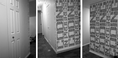
Working in teams of two, strategize and design the news in 3 installments directly on the hallway walls. Each class you will be given a new topic to focus on for the next class. Content 
and materials should be gathered in advance but all work must be executed during the 2 hours and 40 minutes of each class period. All materials used must remain on the wall in some way, shape or form throughout the entire 2 week installation—you must deconstruct, reuse and/or recycle everything. Nothing is wasted. Also, nothing is off limits.

Install 1: There's An Election Coming Up... Select a segment from this week's Daily Show or Colbert Report having to do with the 2012 Election and illustrate the message graphically on the wall. Draw us in with humor, consider hierarchy, voice and image carefully.

Install 2: Its Serious Take us deeper with facts/data on 1 major election issue (Jobs, Taxes, Energy, Education or Healthcare). Make us care. Utilize compelling content — both text and imagery.

Install 3: VOTE! Now get out the vote. You must use the text "Vote Tuesday, November 6" but may choose to include additional text and/or imagery to enhance your specific message. Your goal should be to create the most compelling, densely collaged visual possible — stretching your creativity to the limit as you embrace the physical layering of all accumulated material.

Postmortem Poster: VOTE! Convert your final hallway installation into an 11"x17" poster. Use as much or as little of the physical design as you'd like — embrace the strengths, exclude and/or improve the weaknesses. Create a compelling piece of lasting design and remember that this is the only thing that will remain...

Felita + Jiani: Installation Process

Felita + Jiani: Final Poster

 Bethany + Mansi: Installation Process

Bethany + Mansi: Final Poster

Hannah + Craig: Installation Process

Hannah + Craig: Final Poster

Elizabeth + Shubha: Installation Process

Elizabeth + Shubha: Final Poster

John + Tommy: Installation Process

John + Tommy: Final Poster
Friday, November 2, 2012

Project: Hierarchy

Select one of the first 10 Constitutional Amendments and design a 2-color flyer using the most extreme scale change imaginable via 4 different point sizes. Establish a thoughtful hierarchy that best communicates the intent of the text. Redesign the flyer using extremely subtle scale change — 2 point sizes no more than 4 points apart — while preserving the established hierarchy. The third design should place imagery at the top of the hierarchy, allowing the type to play a supporting role. Maintain the same 2-color palette and typeface throughout but push yourself to reimagine the design possibilities at each stage.

Felita / 2nd Amendment

John / 1st Amendment

Mansi / 4th Amendment

Project: Voice

Find a corner in need of signage and design a specific typographic message for a specific audience. The need can be anything — instruction, warning, even your own thoughts of opinions. Consider the corner an opportunity for change or suspense. Transform the way we see the space. Photograph and mock up your design from the three most commonly seen angles.


Bethany/"Welcome"


Shubha/"Do Not Disturb: Coding in Progress"


Elizabeth/"Pause & Find Clarity"


Tommy/"Are You Forgetting Something"

Wednesday, October 31, 2012

Observation: Layers

Letterpress is an excellent medium to see layers at work. Printing only 1 color at a time means the design must be deconstructed front-to-back. This not only causes colors to mingle in a completely unique way — as physically separate, translucent layers — it also creates a complex surface with an almost tactile depth. Hierarchy and scale must be considered carefully as background often involves more than a simple, solid color — becoming an active participant in the what reads first, second, third... Lastly, old-school wood type letterpress, like these examples from Hammerpress, embraces imperfection and relishes in the "accidents" of misalignments, overlaps and surprises that result from this highly physical process.


You can see how layers are built in this animated gif.

Wednesday, October 10, 2012

Observation: Hierarchy

Book covers are excellent examples of distilled, effective hierarchies. In fact the entire concept of a book is based on an established hierarchical idea: what appears first (the front cover), how all content is organized (the table of contents), and what we are left with (the back cover or spine). These designs by Jason Booher show us how effective dramatic typographic scale shift can be...


...or how intense a subtle typographic shift can be...


...as well as how the integration of image with type can change our perception of overall importance.

Monday, October 1, 2012

Project: Rhythm

Cut a 3.5” square cleanly through a magazine, yielding hundreds of unexpected compositions. Read the provided text and choose 10 of these small squares as the imagery to express that text in an accordion storybook. Consider the rhythm, balance and framing of the images and text within each page, spread and across the entire sequence. Consider the opportunities at the page breaks/folds thoughtfully. Create intrigue on the front and back cover, choosing carefully the best image(s) and text to begin and end with. Consider a possible climax/focal point on the interior.

Click to enlarge!


Project: Grid

Part 1: Choose a common emotion and design a compelling 3-step color story to express that emotion visually. Photograph 150+ objects and/or environments that illustrate the spectrum of these colors — particularly the colors in between. Crop 1 image into each grid module or chose to leave some grid modules white. Consider proportion (hierarchy) and the figure/ground.

Part 2: Evolve your story using language and typography. Write a 140-character Twitter poem expressing your color story. Choose a typeface that embodies the tone of your story. Using the grid in a more flexible way, recreate and/or improve the original color story using only type.

Elizabeth/"Distraction"

Jiani/"Love"

John/"Anger"